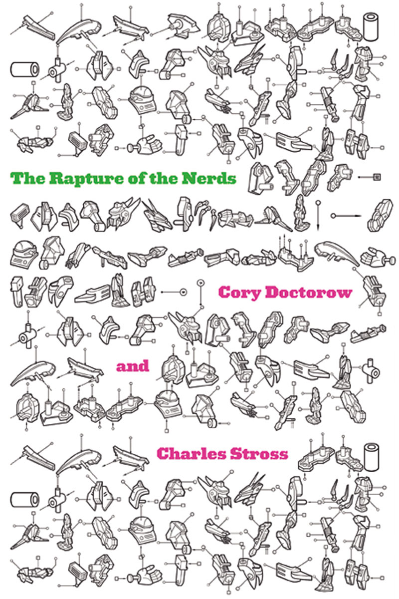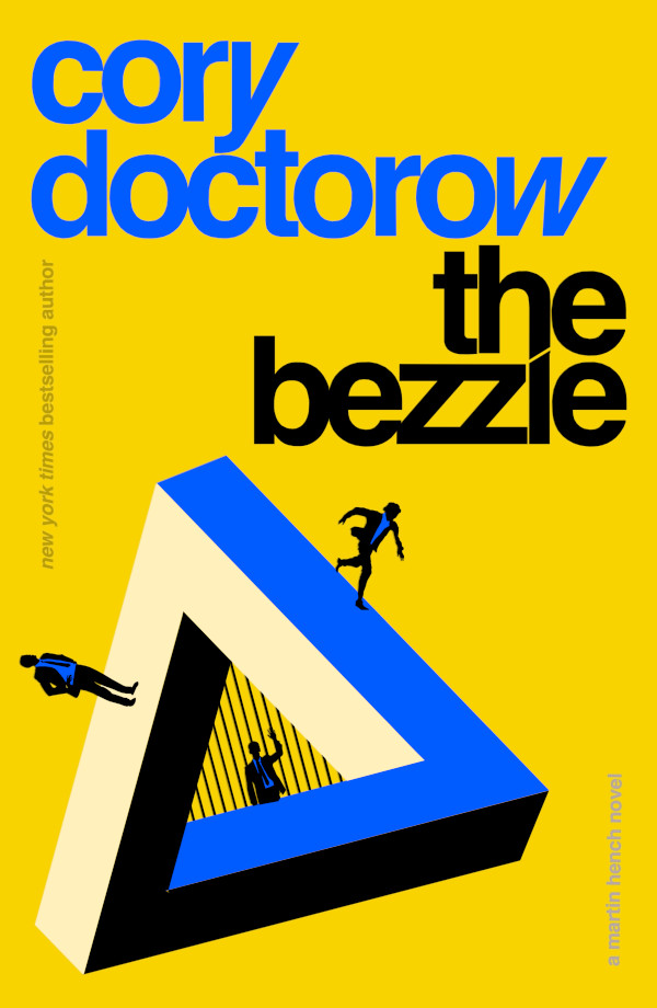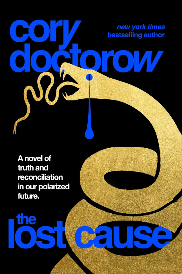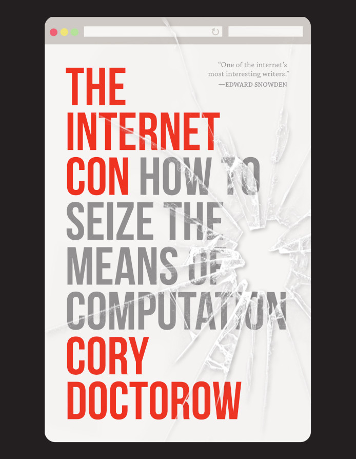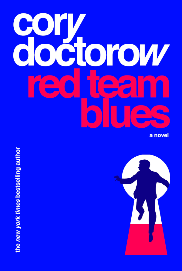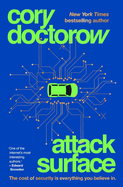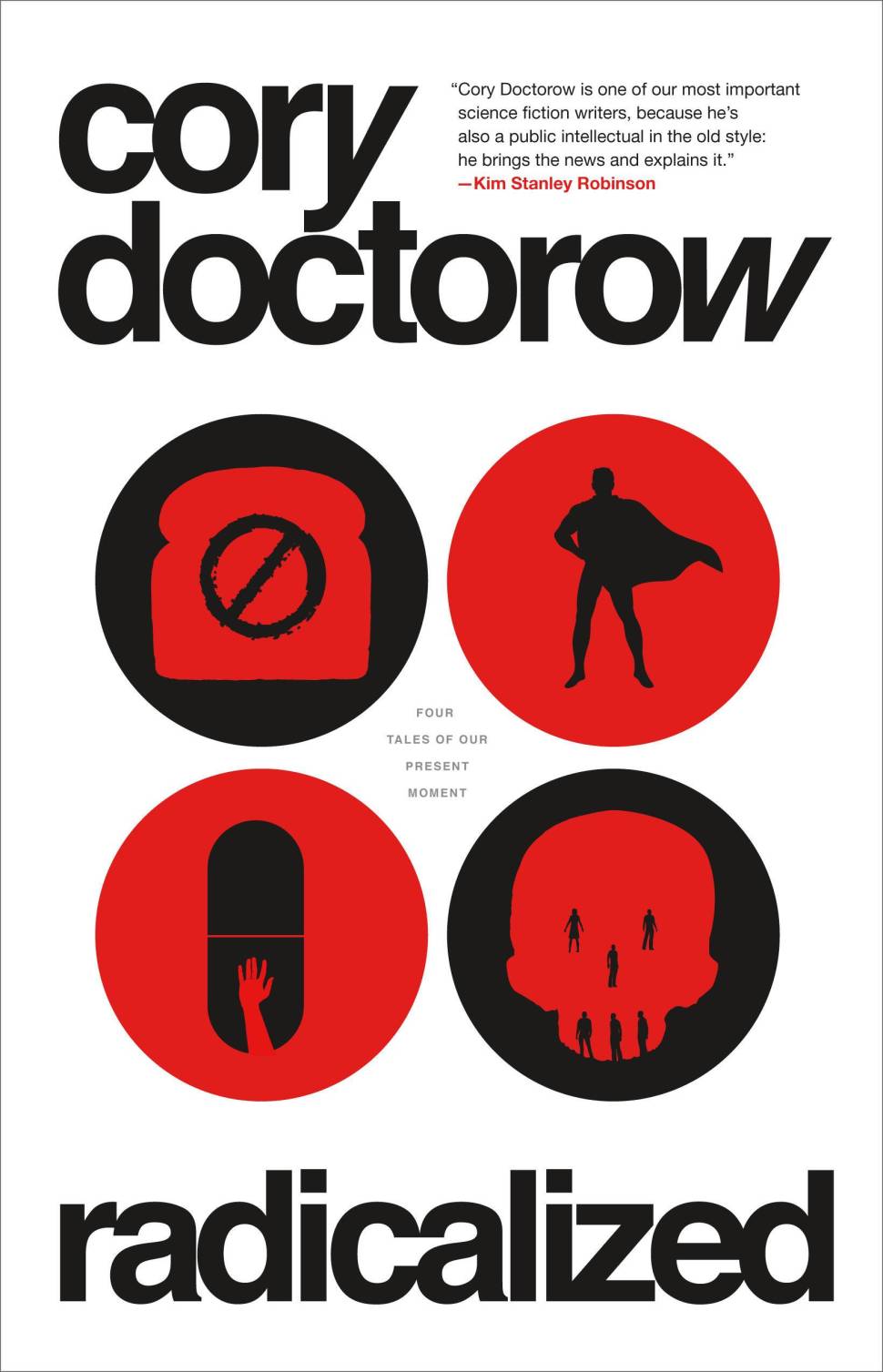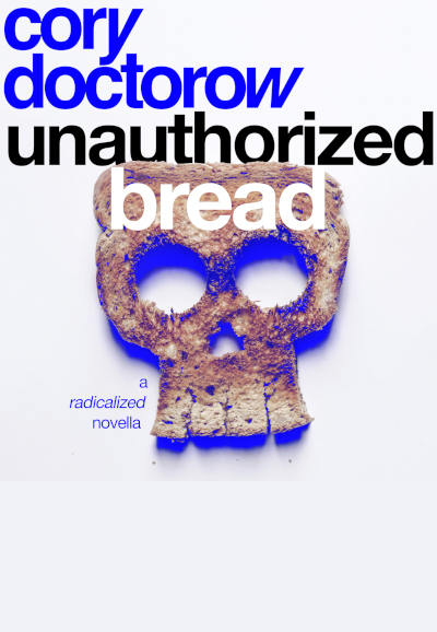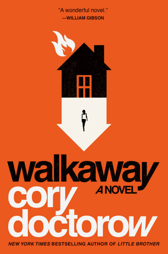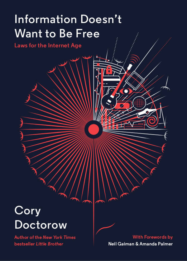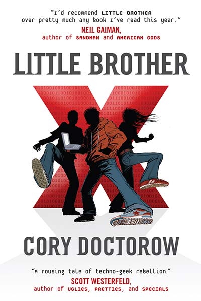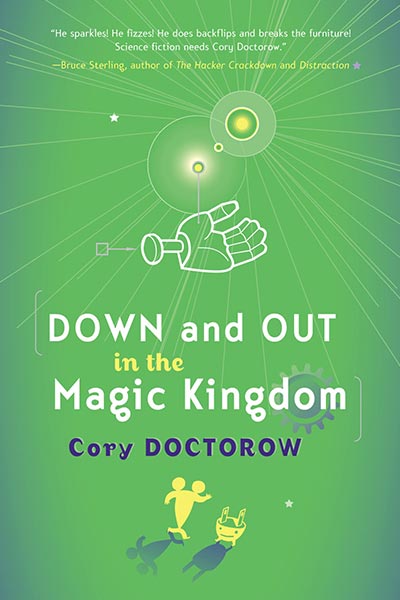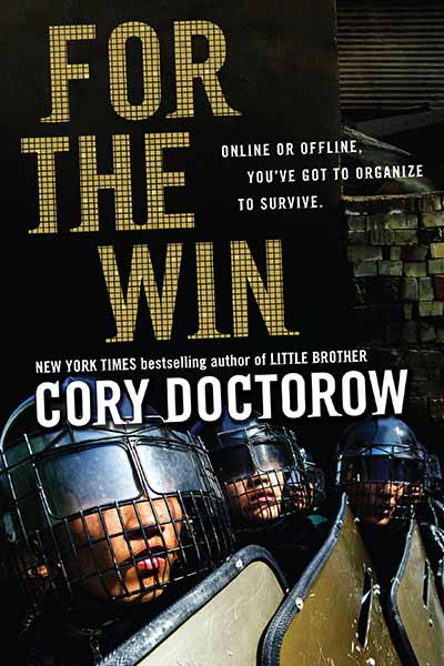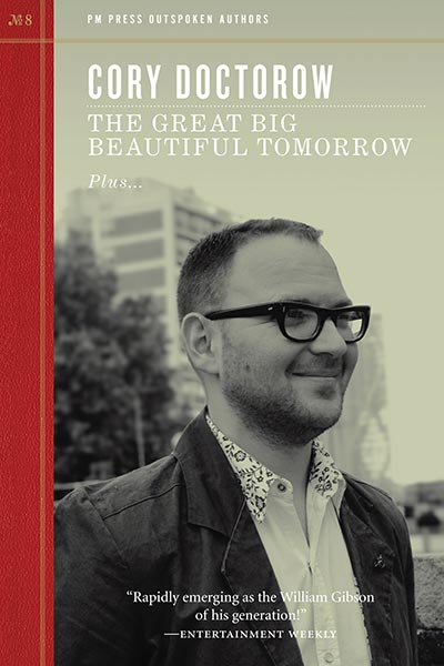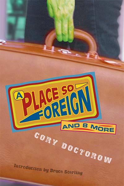
I’m really impressed with the cover of the UK edition of Rapture of the Nerds, the novel I wrote with Charlie Stross. But it turns out that producing that cover was quite a journey. Designer Martin Stiff was kind enough to share his notes on the process, along with all the proto covers he produced for the UK publisher, Titan Books:
Designing book covers is the best job in the goddamn world. If you’re lucky, like we are at Amazing15, you get to work with incredibly talented and lovely people, on some of the most fiendishly interesting projects you can’t even begin to imagine without the aid of viralised nootropics.When the incredibly talented and lovely Cath at Titan Books asked us to design the UK cover for Cory Doctorow and Charles Stross’ The Rapture of the Nerds we braced ourselves. If you haven’t read it, do it now. The book is a melting pot of brain-warping ideas, every time you think you get a handle on what it is, what it means, it shifts in your hands like an organic Rubik’s cube.
Books which can manipulate reality aren’t easy to design covers for. When you start a new project there’s generally two initial ways in: 1) you step into it and find a moment, a scene, an element and pin your cover design on that or 2) you step back and look at the overall picture – try and find the theme. But what do you do when that picture seems to keep changing? The answer is, you keep chasing it. And what happens when there’s other people involved in the process, each of whom has their *own* take on the book, a take which fluctuates as wildly as your own? The answer is you chase even harder and you don’t look back.
The first ideas we turned in were turned down. They looked non-fiction (v2), or too young (v3). Version 4 hung around for a while but it quickly became too *normal* and that’s just not something the novel is, so we threw it out. We fiddled with icons and graphics (v5, v6) and impossible shapes (v7) to match the impossible shape of the story but each time the book out-thought us and proved us wrong. Version 8 hung around for a while, but it still didn’t feel *right* dammit, it felt like a good book cover but Nerds isn’t *just* a ‘good book’, it’s so much more than that. For a while there we lost the plot entirely (v9 was so wrong it had to be fired into the heart of the sun to destroy it), and when we came back up we played with colours and abstract patterns like madmen. Version 10 and 13 had something – after weeks of getting dirty with angry covers that weren’t right we liked the simple cleanliness and easy lines. It felt like a breath of fresh air. It felt like The Rapture of the Nerds.
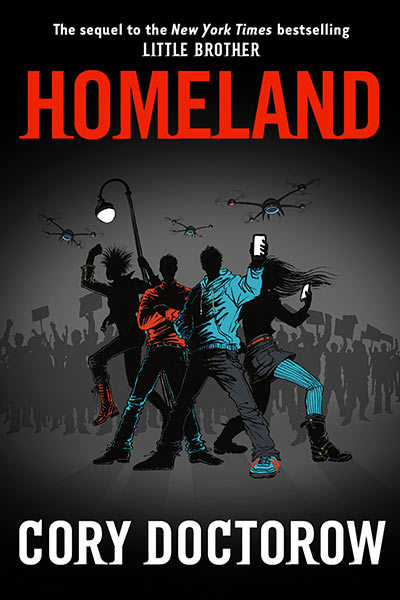
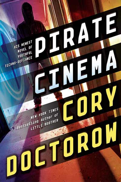
We chased harder. We imagined a bright spectrum filtered through a fractured pattern, clean fonts with nothing to hide. We got close. We kept the chaos subtle, a radiation of binary noise printed in spot varnish so you can only see it in angled light but you can feel it all the time under your fingertips. We got close and we caught it (v15). It wasn’t easy, but if it gets easy, you’re doing it wrong. We’ve just finished designing the covers to Doctorow’s Pirate Cinema and Homeland. Designing book covers is the best job in the goddamn world.Martin Stiff, Amazing15


