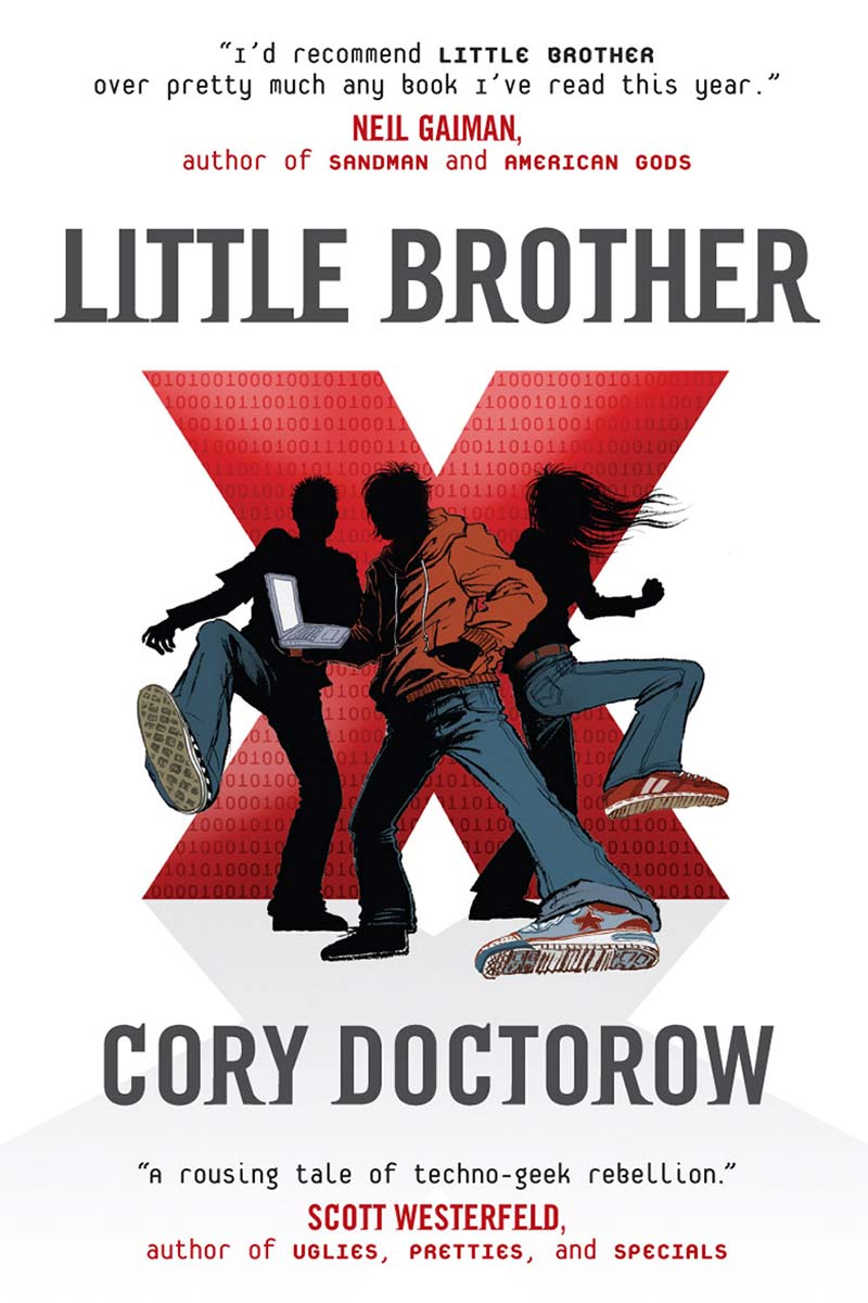
Bruce M Campbell created a lovely alternative PDF of Little Brother:
I took the HTML version, ran some type-cleaning things on it, and restyled it using, of all things, Apple’s Pages 8. I thought about using Adobe InDesign, but as my intention was to produce this as a PDF, thought that ID would be over-kill.
I’ve styled it as I thought it appropriate to the subject matter and the fonts I have on my system.
I’ve used Rockwell for the the Chapter titles and heads as I think the sardonicness of the “All-American” feel covers the “on-message” hypocrisy of the overall government policy here, and Minion Pro for the body, because I think it’s a very readable font, and the innate typography, especially with the punctuation characters, makes it disappear for the reader. For novelty, I’ve used Orator for the IM texts, and ITC AMerican Typewriter for the literary extracts.
